Built for The Spotlight: The Voortman Studio Rebrand
Ancaster Memorial Arts Centre
Branding Design | Logo Design
Video Credit: Ancaster Memorial Arts Centre Bookings
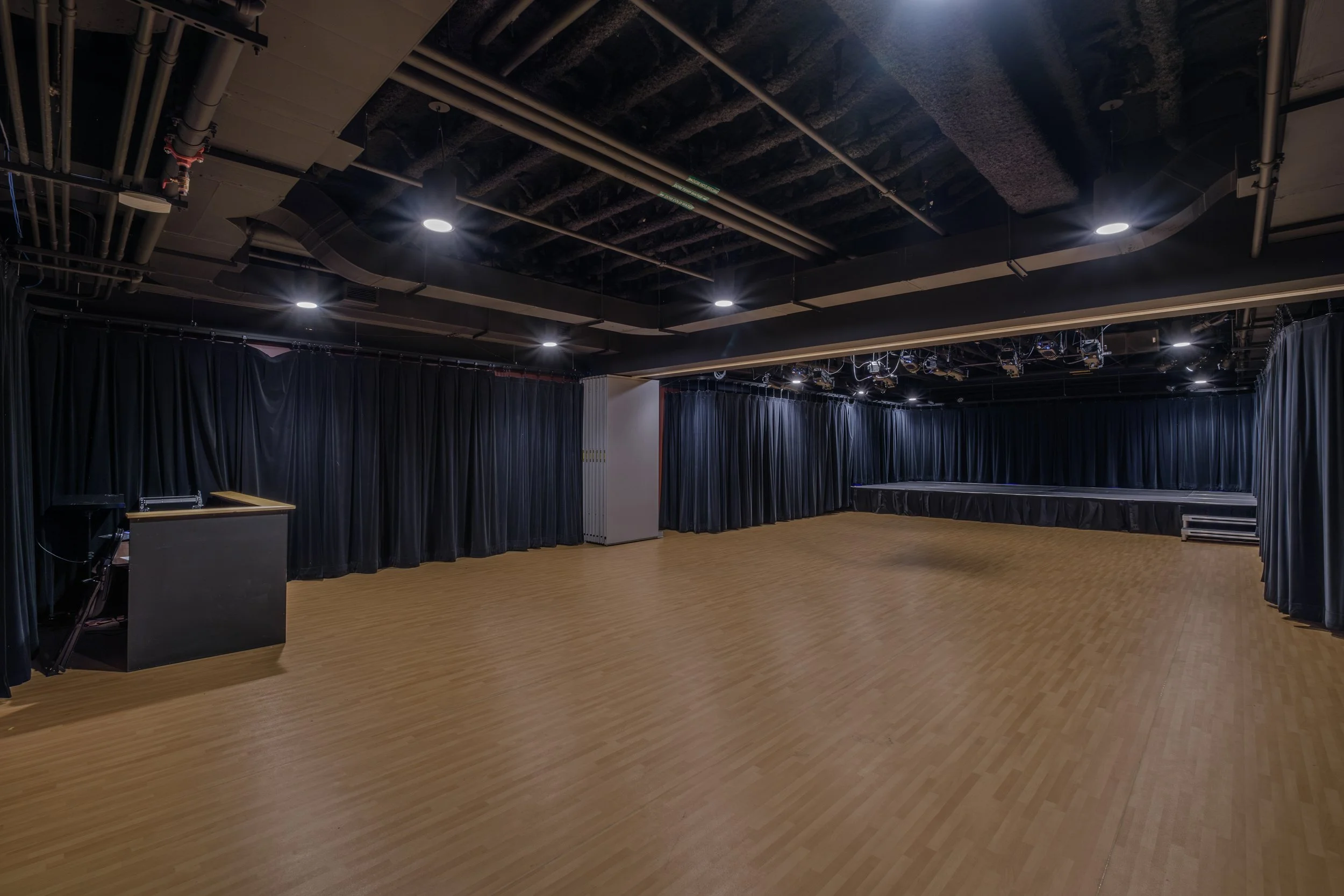
The Voortman Studio required a complete brand identity system to position itself as a premium yet accessible performance space for local artists and producers.
As a sub-brand of AMAC, it needed to feel distinct yet connected, balancing professionalism with warmth, intimacy, and ease.
Brand History
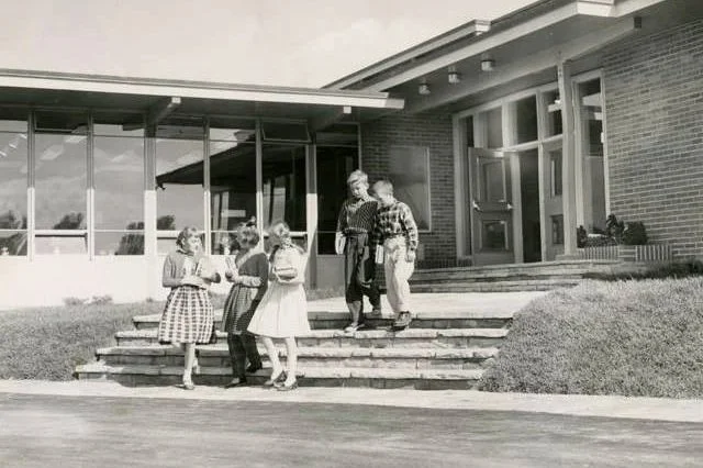
Originally built in 1940 as a school gymnasium, the space once hosted community gatherings and first performances for generations.
This history revealed a powerful positioning opportunity:
The Voortman Studio isn’t just a venue—it's the moment the spotlight first shines.
I translated this into a brand concept centred around “the first spotlight moment”—
the first show, first sell-out, first standing ovation, and first step into something bigger.
My Role
I developed and presented a full rebrand strategy and visual system through a pitch deck, aligning creative direction with business goals and audience needs.
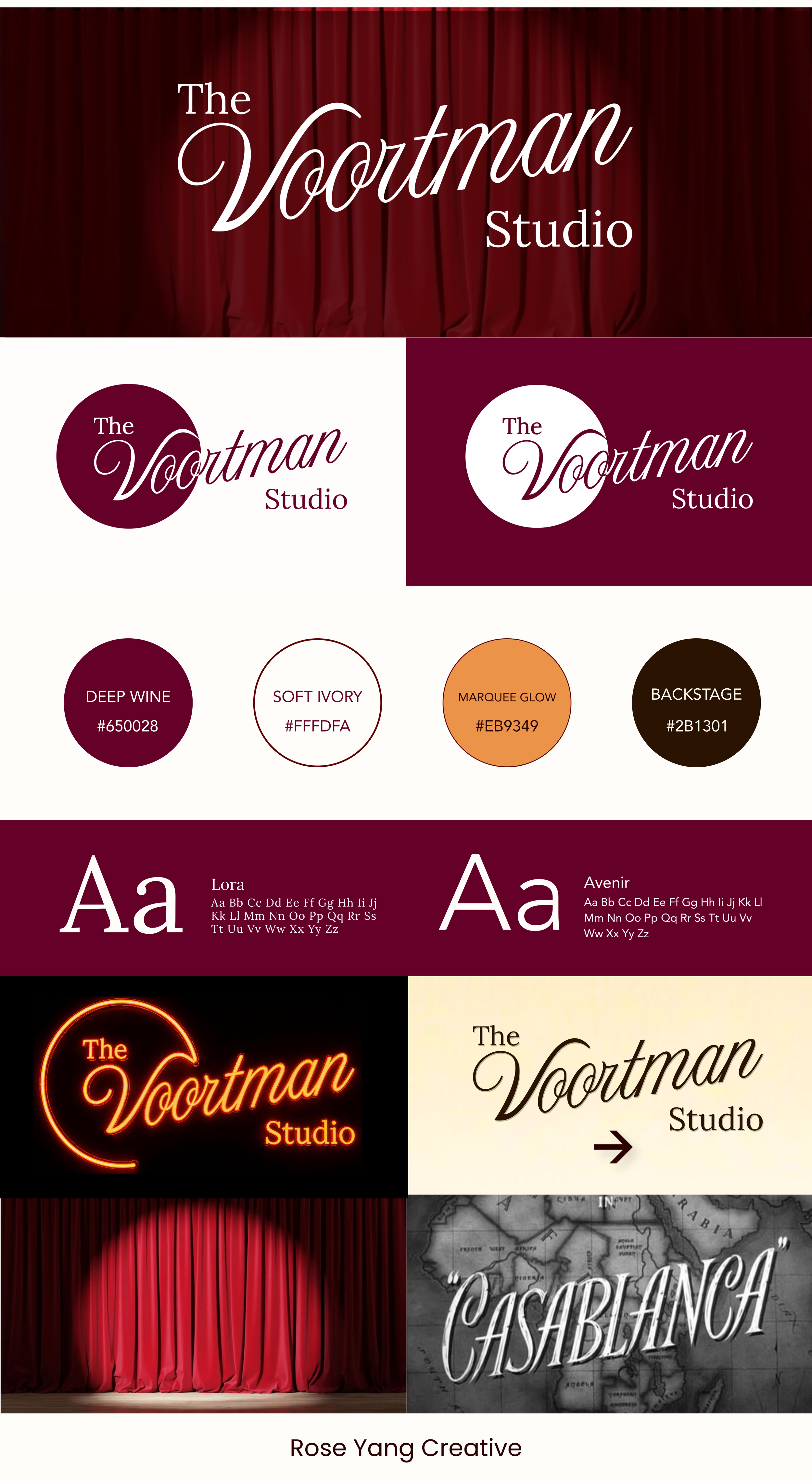
The Brand Kit: The Cinemetic Spotlight
The defining element of the identity is a circular spotlight form surrounding the wordmark.
This circle represents:
A stage spotlight
A gathering space
A sense of beginning
An intimate performance environment
It visually communicates focus, proximity, and emotional intensity, while differentiating the studio from AMAC’s architectural branding.
Inspired by 1940s cinema and theatre signage, the layout and typography of the logo connect to the building’s origins and evoke a sense of romance and performance.
Neon Sign Application
The glowing ring reinforces the idea of being “in the spotlight,” while increasing visibility, memorability, and street-level presence.
Before
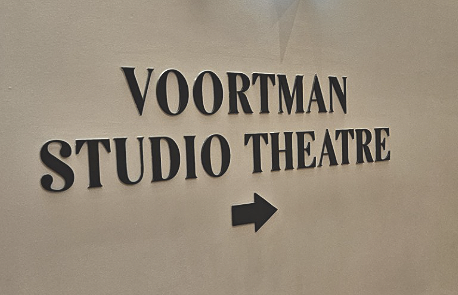
After
The Impacts
Established a clear, differentiated positioning within the local venue market
1.
2.
Created a scalable identity system for marketing, signage, and programming
Enhanced brand visibility and recognizability