Healthcare Branding
Toothsure
Designed to Care: Toothsure Brand Kit
Project Overview
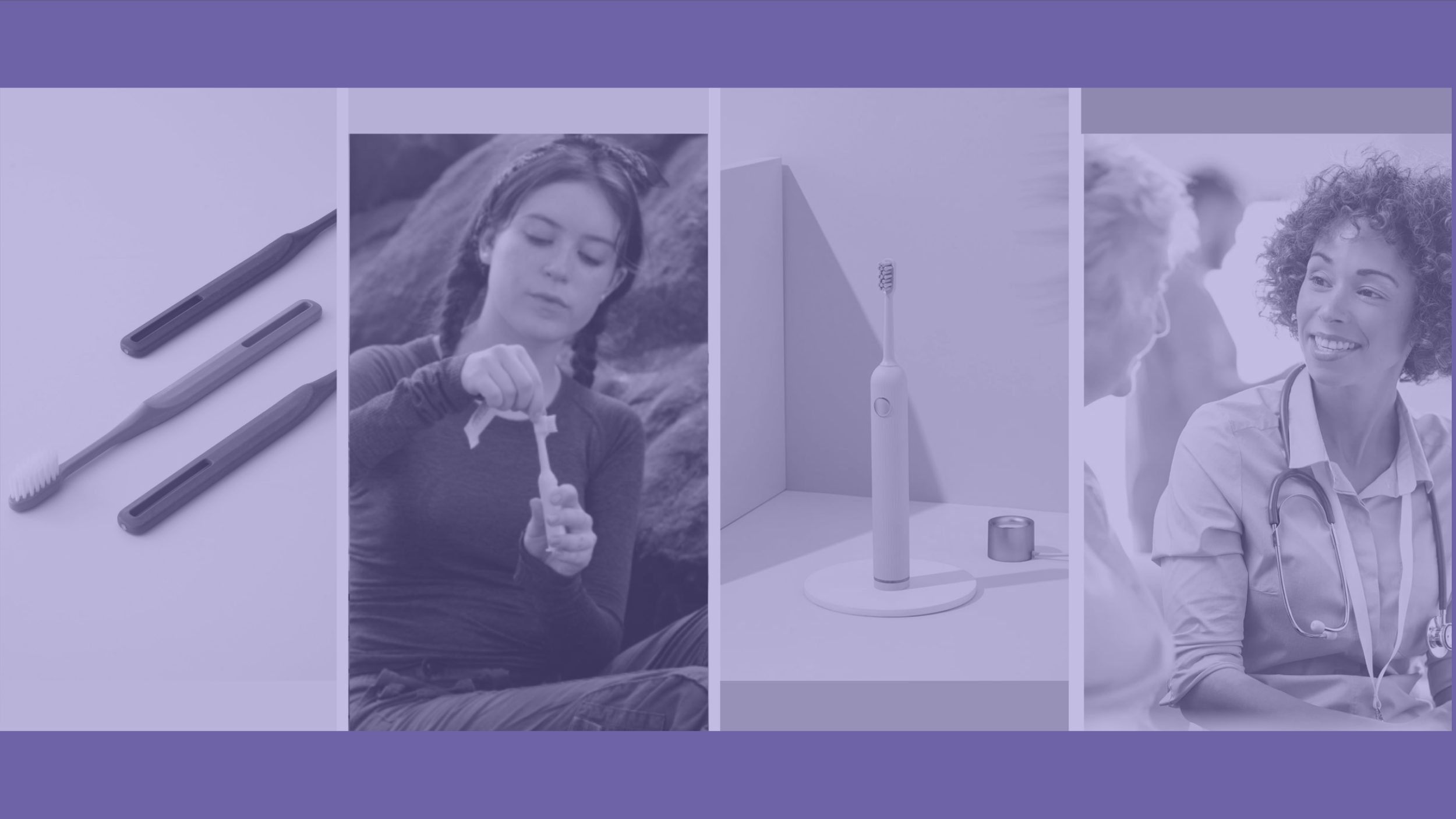
Toothsure is a value-driven oral health startup creating solutions for dental care outside traditional settings, from hospitals to business travel.
The brand needed a cohesive identity that balanced clinical trust with emotional warmth while remaining accessible to both healthcare professionals and everyday users.
What We Did
I partnered closely with the founder and COO to develop a comprehensive brand kit that expanded on Toothsure’s existing logo and visual direction. Going beyond surface-level branding, I introduced a refined colour system, typography, a brand personality, and a mood board that highlighted the product’s innovative and versatile nature while staying grounded in care and accessibility.
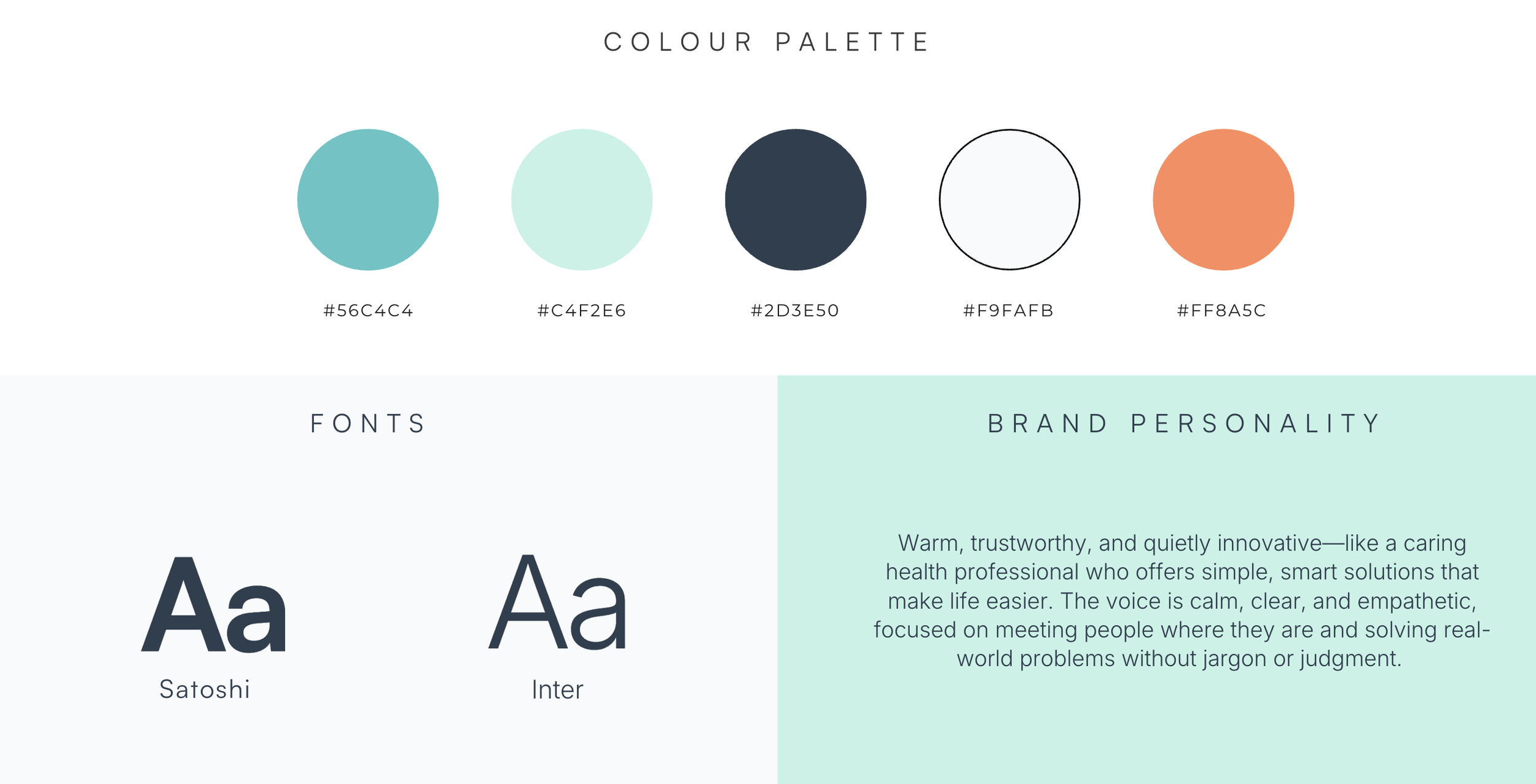
Fonts: Modern and Approachable
Primary — Satoshi
A modern, geometric typeface with rounded edges that feels innovative yet approachable.Secondary — Inter
Highly readable and neutral, ideal for body copy across digital and instructional content.
The Thoughts Behind
Color Palette: Calm Meets Clever
The palette was designed to sit comfortably between clinical and lifestyle, ensuring Toothsure could live seamlessly in both hospitals and airport carry-ons.
Soft Navy (#2D3E50)—Primary anchor
Evokes trust, authority, and medical credibility without feeling harsh.
Fresh Mint (#C4F2E6)—Background/accent
Signals cleanliness and oral freshness, adding breathability to the brand.Cloud White (#F9FAFB)—Base neutral
Creates space, simplicity, and a sense of hygiene.Coral Pop (#FF8A5C)—CTA accent
Used sparingly to introduce warmth and a spark of friendly innovation.
Established a clear, scalable brand foundation
Impacts
Reduced ~40% creative decision-making time
used across social media and web design
for content creation post-launch
Supported social content with a consistent visual identity
that resonated with both clinical and consumer audiences